Sunday 29 August 2021

pxRadioButtons Control Format Pega

 Hi Friends, recently I have learnt how to use segmented radio button.


Radio button has 2 control format

  • Standard
  • Other 
    • Segmented    

In this post we will see the differences.

Drag and drop the radio button in to the section.


By Default orientation for the radio button is Vertical. and in UI radio button display looks like the below image.


I have updated the orientation to Horizontal.


In the UI, radio button looks like this.


In Horizontal orientation, selected control format as Other and other control format as Segmented


In the UI, radio button looks like this.


Thanks for reading this post☺

Saturday 28 August 2021

How to use CSS helper classes in Pega

 Hi Friends, In this post we will see how to add CSS helper classes


In W3Schools website, a exercise is present to display background image in UI. We will see how to do the similar kind of CSS changes in Pega using CSS helper classes


W3Schools Try it editor URL:

https://www.w3schools.com/css/tryit.asp?filename=trycss3_background_multiple


Step 1: Download below image and upload to binary file

Image to download:


Upload the image to a binary file rule, I have provided binary rule name as paper and image of type jpg and directory is webwb.


Path of this image is  webwb/paper.jpg


Step 2: Create CSS Helper class in Skin Rule

Open skin rule by clicking on application -> Skin


In the skin rule -> In Include Styles tab -> add a additional style sheet if not present.


In the CSS text file added class and its style. ( Class name should start with dot .)


Step 3: Mapping CSS helper class in UI 


We will try to add this paper image as background for the highlighted section in User Portal.


By using accessibility tool, I got the section used to display 'to do'


In the HomeWorkList section highlighted layout has 'to do' repeating dynamic layout. Open the layout properties in presentation tab and enable the display advance presentation option and add the class in container CSS class.


Save and reload the portal

Result:

We can see the background changed and our image displayed in background.


Hope you can understand about this topic. If you have any doubt ask in comment.☺


Thursday 26 August 2021

How to use inline layouts in Pega

 Hi Friends, In this post we will see how to use Inline Layouts

Inline Layout:

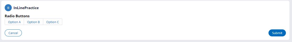
If you are using inline layouts, the elements will arrange in a line(One by one to the left)


Below is the Inline layout details


I have provided layout format as Inline.


I have added 5 text box inside inline layout,  we will see how it displayed at run time.


you can see the text box are arranged one by one to the next, if space not present the text box will wrap to the next line.
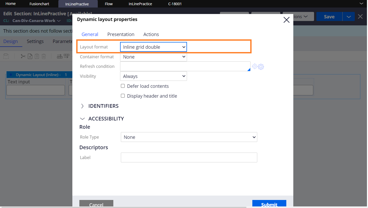

Inline-Double:

Below is the Inline grid double layout details


Provided layout format as Inline grid double.


you can see the text boxes are arranged in two column


Inline Grid Triple:

Below is the Inline grid triple details


provided layout format as inline grid triple


you can see the textboxes are arranged in 3 columns


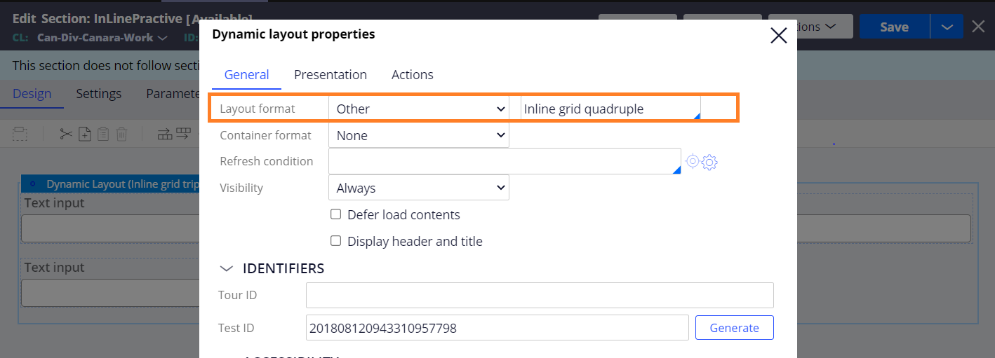
InLine Grid Quadruple:

Below is the details about inline grid quadruple


Provided layout format as other and selected inline grid quadruple.


you can see the text boxes are arranged in 4 columns


Inline Label left:

Inline label left is same as inline layout but the labels will arrange in the left to the fields


provided layout format as other and selected inline labels left


You can see the labels are arranged left to the text box.


Inline middle:


Inline middle layout will arrange the content in vertically centered format.


Below is the sample pega UI Gallery section used inline middle.


you can see the contents are arranged vertically centered at runtime.


Similarly, we are having Inline middle labels left to keep the data in vertically centered and lables in left.

To know more about Pega layout go through the below URL

Using layouts to structure content in sections | Pega

Dynamic layouts and containers | Pega Academy

Using dynamic layouts to create responsive user interfaces | Pega


Thank you for reading this post, ask in comment if you have any doubts.


Tuesday 24 August 2021

How to use pxInitials Control in Pega

 Hi Friends, In this post we will see how to use pxInitials control.

Below is the Initials Control.


In Pega UI Gallery, -> repeating dynamic layout screen we are having sample section.


Below is the section used for the above screen, for Initials control, in the name parameter we have to provide the property for which we wants initial.


for example, if pyName property has value Hello World, then initials will display like HW.

Hope this concept is understandable, ask in comment if you have any doubts. Thanks.☺

Sunday 15 August 2021

How to use Media Capture Pega component

 Hi Friends, In this post we will see how to use Media Capture for Pega component.


Link for Downloading Media Capture for Pega component

https://community.pega.com/marketplace/components/media-capture-pega


Go through the Pega documentation:

https://community.pega.com/knowledgebase/articles/capture-screen-and-record-video-component/other/capture-screen-and-record-video-component


Extract the downloaded jar file, after extraction we can see a jar file inside it and license text file.


Important: We have to upload this jar into pega.


Click Manage component button in application definition


Click on Install New button and upload the jar file we have extracted.


After installation, in available component list we can view our component.


Note:   If you can't able to import the component through install component page, try to import the jar through configure -> Application -> Import landing page.

Below is the list of rules present in this component’s ruleset.


With this component itself , pega provided example section for testing.


Below is the example section, include this seciton in any flowaction and run in a flow to test the component.


After ran the flow, example section look like this. Click capture screen and capture video button .


After recording and screen capture, we can able to view the attachment in attachment section of case.


In additionally, we can able to view screenshot option is available in case option menu.


Thanks for reading!☺