Thursday, 26 August 2021

How to use inline layouts in Pega

 Hi Friends, In this post we will see how to use Inline Layouts

Inline Layout:

If you are using inline layouts, the elements will arrange in a line(One by one to the left)


Below is the Inline layout details


I have provided layout format as Inline.


I have added 5 text box inside inline layout,  we will see how it displayed at run time.


you can see the text box are arranged one by one to the next, if space not present the text box will wrap to the next line.


Inline-Double:

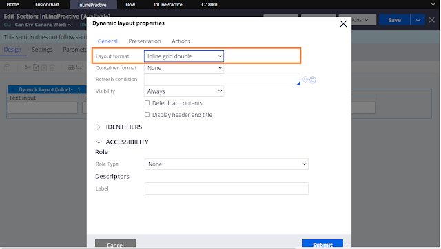
Below is the Inline grid double layout details


Provided layout format as Inline grid double.


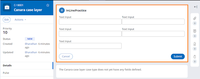
you can see the text boxes are arranged in two column


Inline Grid Triple:

Below is the Inline grid triple details


provided layout format as inline grid triple


you can see the textboxes are arranged in 3 columns


InLine Grid Quadruple:

Below is the details about inline grid quadruple


Provided layout format as other and selected inline grid quadruple.


you can see the text boxes are arranged in 4 columns


Inline Label left:

Inline label left is same as inline layout but the labels will arrange in the left to the fields


provided layout format as other and selected inline labels left


You can see the labels are arranged left to the text box.


Inline middle:


Inline middle layout will arrange the content in vertically centered format.


Below is the sample pega UI Gallery section used inline middle.


you can see the contents are arranged vertically centered at runtime.


Similarly, we are having Inline middle labels left to keep the data in vertically centered and lables in left.

To know more about Pega layout go through the below URL

Using layouts to structure content in sections | Pega

Dynamic layouts and containers | Pega Academy

Using dynamic layouts to create responsive user interfaces | Pega


Thank you for reading this post, ask in comment if you have any doubts.


No comments:

Post a Comment